F1 Standings - Fun with Animations, Symbols, and Table Calcs
I’m thoroughly addicted to Formula 1. I’m ok to admit it, the blame can be placed squarely at the feet of Netflix’s Drive to Survive.
To make tracking the F1 season even more fun, I thought why not follow standings in a fun and interactive way. Also, I’m a sucker for bar chart races even though they are rarely useful. Ditto using symbols on a map. Finally, I’ve never had a problem with level of detail (LOD) expressions in Tableau but I continue to struggle with Tableau calcs. It might be related to how much I loathe Excel formulas (formulae?)!
With this background, I set out on creating my viz.
First, the easy step. Getting the weekly standings - thanks espn.com! Put these into a Google sheet, import to Tableau, pivot the weeks, and get started.
Next up, how to show the progression through the season similar to a bar chart race without a single, run-through animation. I had to take standings and do the straightforward RUNNING_SUM on them, after sorting races by the proper race order. The challenge of putting these only on a bar was losing the magnitude of points a driver captured on any given week. To tackle this problem, I went with a dual-axis chart with circles on my second axis sized for points won in a given race. This approach had one big trade-off, specifically, the points come when drivers get them and there isn’t a dot for every race (i.e. when the driver scores zero points). However, I think this trade-off is worth it because I am showing the magnitude of driver points relative to each other. In the end, I realized that showing the progression of points based on every race (whether the driver scored points each week or not) would be a different visualization completely.
Now the animation part. I created a calculation to number each race.

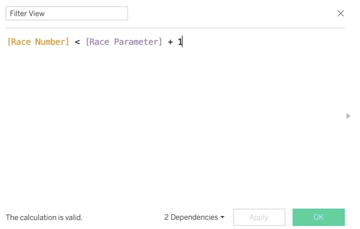
The calculations to number the races

With the number for each race, I could allow interactivity to show driver standings “as of” a given week with the following calculation set to true on a filter.
To set the view when combined with a parameter action
The Race Parameter is a parameter with integers corresponding to race numbers. Now, with viz animations on, I have the user-controllable aspect of a bar chart race if I combine it with a parameter action.
For the parameter action, I created a sheet with the numbers and then set symbols on the marks card. I downloaded map icons from Flagpedia.net, placed them in My Tableau Repository, assigned them, and (sorry for the pun) off to the races!
From there it was just laying out sheets on a dashboard and cleaning up tooltips with one exception. How to get the total number of points on the viz without needing to hover for the tooltip. I couldn’t really put them at the end of the last circle (at least not in a way I could think of… I’m sure others could). The problem with putting it at the end of the bar was that the bigger circles would overlap. So, the following calculation (with the right table calc addressing) to the saviour.

Label for End of the Bar
You can find the viz here on Tableau Public.
I hope this viz is useful for other F1 fans and people wanting to learn Tableau to create some of these tricks for interactivity!